Manufactured
Backstory
Initially, Manufactured was created with the idea of digitizing the apparel supply chain to support the sourcing needs of brands, agencies, and enterprises in the new age of connected commerce. The goal of Manufactured was to give vendors, designers, brands, and the customers the ability to communicate to all parties and manage orders on a single platform.
Role
UX | UI Designer
Product Designer
Project Manager
Team
Jonathan Narvaez, Design
Dexter Krishnan, Project Manager
Project Length
Feburary 2018
-
November 2019

–––– DISCOVERY
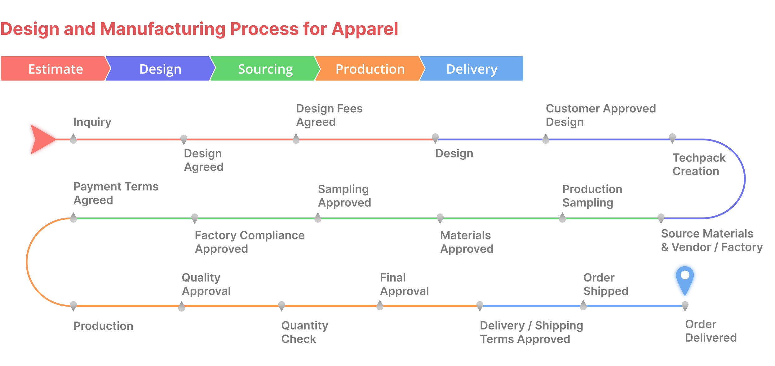
So how does it work?
An early challenge to overcome was our lack of knowledge in the manufacturing industry as a whole. We were given a list of features and a few types of users, and the process of manufacturing was explained in detail to us by our industry expert CEO.
An abbreviated journey map of a single manufacturing order. Estimate, Design, Sourcing, Production, and Delivery represent the stages of the manufacturing process
Turns out, the manufacturing process is a complicated one with a lot of moving parts. Brands might have their own designers or need to seek outside help, vendors represent factories all over the world, each with their own time zone, languages, logistics, feedback, communication, etc. There are also shipping companies to think about, agencies that can represent any of these parties in different capacities ––– It’s a challenge to keep track of everything.
Along with the many moving parts, each party is using their own software, methods, and internal systems to accomplish their goals:
A combination of email, SMS text, various messaging platforms, or phone calls for communication
Email trails, phone call trails, or actual paper trails to track the progress of orders
There are a lot of handshakes, winks and smiles, and verbal contracts used at different stages of the manufacturing chain. Using these verbal contracts, paper contracts, and other less formal or outdated arrangements makes it difficult to collect and make payments in a timely fashion
Summarizing the pain points in this process helped us narrow down and identify possible design solutions.
Manufacturing Pain Points
• Communicating with all parties
• Keeping track of orders at different stages of the process
• Multiple platforms are used to organize
files and other information
Design Solutions
• Give users a way to communicate with each other on one platform
• Show a way for users to track their orders every step of the way
• Give users tools to organize their files in a central location

–––– IDENTIFYING USERS
Now that we’ve figured out the manufacturing process as best we could, our next task was figuring out the process for the people behind the manufacturing. During our discovery phase, we identified key people at key points of the process that we wanted to focus our efforts on. These users represent different stages of the manufacturing process.
There are many areas where these users’ individual processes overlap, which means they will have common pain points and common goals. Any solution that we come up with has to solve the same problem for multiple users, while also ensuring the users can still achieve their individual goals.
Brand
The customer, usually handling multiple accounts. This could be a single influencer or someone representing a larger brand
Pain Points:
• Lack of communication with designer, difficult to track multiple orders
• No contact with manufacturer
• Difficulty tracking multiple orders because of out of date systems
Designer
Responsible for creating the design doc. Could also be a Brand or Vendor type user
Pain Points:
• Limited to local manufacturers and customers
• Newer designers have trouble with visibility; getting their name out there to meaningful platforms outside of social media
• Linear design process. No room/time for customer feedback
Vendor
Responsible for the production of the product. Usually a single person in charge of running the factory
Pain Points:
• Limited to no contact directly to customer
• Limited worldwide reach; sticking to the same region/country/etc. when they have the ability/potential to expand
• Maintaining a loyal customer base; competitive market makes it hard to keep customers loyal
In each of our users, we found that communication is the number one — or at least the very first — problem that needed to be solved. Our idea was to create a chat where users can keep SMS, email, WhatsApp, and browser chat conversations in a single stream. Doing this would accommodate all user types and give them the option to communicate how they want using methods already familiar to them.

–––– DESIGN Part 1: The Chat
Designing the chat
We of course wanted to create a chat that felt familiar and easy to use, while still implementing necessary features. Taking inspiration from familiar and popular messaging services like WhatsApp and Facebook Messenger, we designed a chat where the users would be able to send files, communicate, and keep track of their conversations from multiple sources in a single stream.
Early wireframes of chat. Here we walk through the process of uploading a file to the chat and sending it via the chosen method.
In this case, a file is being attached and sent to a customer as an email.
Design thinking moving forward
Moving to higher def, we wanted to look over the low-fi prototype and figure out what we wanted to take from it moving forward, and what was going to be left behind.
It’s a very simple design to start off with, which means users won’t have to adjust their behaviors too much. Familiarity shouldn’t scare users off the platform, especially if there’s enough value in the process. The goal is for the product to be good enough at providing the value to retain users by itself, but we’ll progress a few steps at a time.
Multiple forms of communication in one window is weird. It’ll be an interesting design challenge to make files, emails, SMS, and system messages look good on one window — on a system that you’re using for work. Personal use? It might be fun. But again, if the service provides enough value to the user, they’ll manage.
Mockup of the chat. This example is showing how to switch from browser chat to sending an email.
We will definitely have to look up WhatsApp integration and how it’ll work and look to influence our design moving forward.
This was a good start to a very idea-heavy product, with features being requested and the scope changing weekly. We had made good progress on the chat, but we needed to move on to other features of the platform. The biggest one being Milestones, a feature that would take a lot of work, thinking, and testing to get right.

–––– DESIGN Part 2: Organizing Features
Milestones
While having a chat to keep track of all of your conversations from multiple platforms was was great, it only solved a small problem in manufacturing. There are many stages involved in a single order, and each stage has specific requirements that need to be met in order to proceed to the next stage. We called these stages Milestones, and there were a ton of them.
Organizing these Milestones was a challenge, mostly because there was no universally set list of them. Much like the rest of the industry, there was no standard for the process. But there were similarities, and we grabbed the similar steps and tried to combine them to make a universal set of Milestones.
Grouping the Milestones into the Estimate, Design & Sourcing, and Final Quote phases helped make them more easily digestible. Using more common names would help users identify common themes in similar processes.
Design Challenges for Milestones
The original idea for Milestones was was relatively simple. Users had been using logistics apps and services like Uber and Doordash for a while, or even Amazon. There are basic expectations that need to be met as far as status of order. You’re given an expected time or date of arrival, you’ll get some transit updates while your order is en route, etc., until your order arrives. It’s a relatively linear process that I wanted to duplicate with the intent of shortening the learning curve that comes with using a new platform.
The challenge comes with the non-linear fashion of the manufacturing industry. So while Estimate, Design & Sourcing, and Final Quote were linear in name, each milestone in each phase could be completed at any time or skipped entirely.
Outside of the names, the Milestones are identical. Each would have to contain files, notes,
Early prototype of the Milestones page. Each Milestone began with containers for forms and file uploads. Each could be marked “complete” with a click, signaling that the tasks within the Milestone had been completed, or that the Milestone could be otherwise skipped.
The first working design of the Milestones page would definitely need more work, but we felt it was a good enough start to allow us to move onto the frequent features being added.

–––– DESIGN Part 3: Expansion
Expanding the team and my role within it
The product the we had build so far allowed our owner and CEO to raise quite a bit of funding. Enough funding to expand the development team, move offices to a new location, and change the previous scope of the product.
Also included in this expansion was an expanded role for myself, which saw me managing two new overseas developers and eventually an outside designer.
Redesigning for Features
As more features and requirements rolled in, we realized that we were running out of space on the Milestones page. Files, conversations from messaging, chat within milestones, and assigned tasks per milestone were now essential and these features became too much for the current design. The goal of the redesign was to implement all of the new features rolling in while maintaining the current workflow and feel that users had already responded well to.
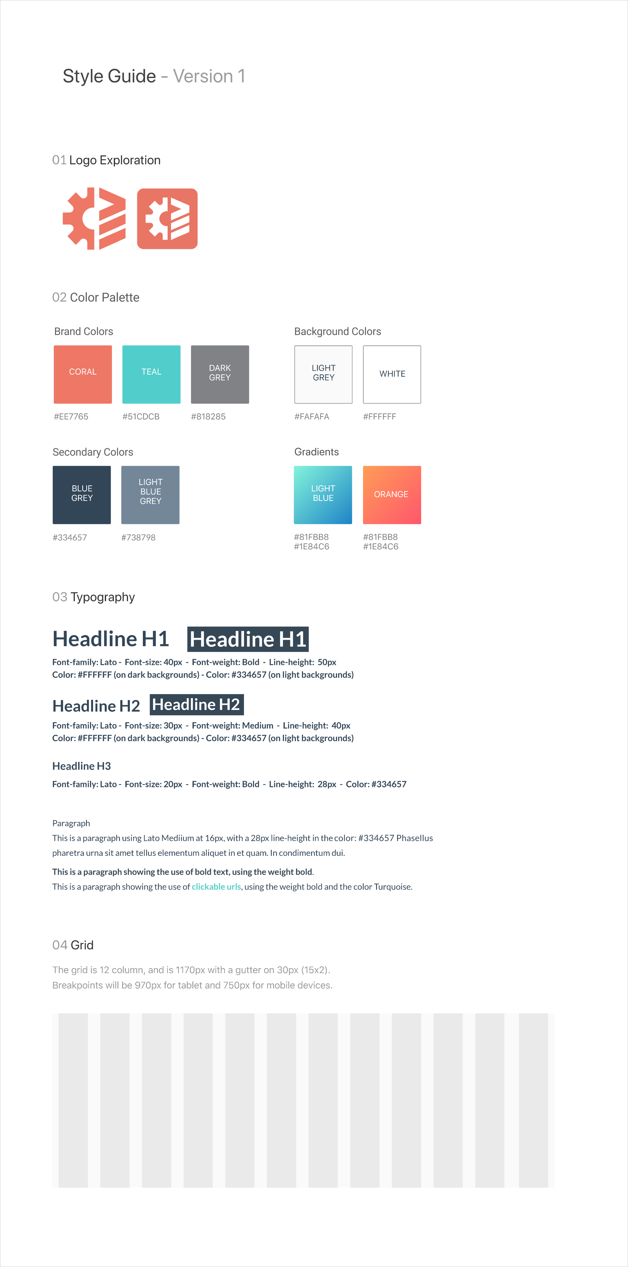
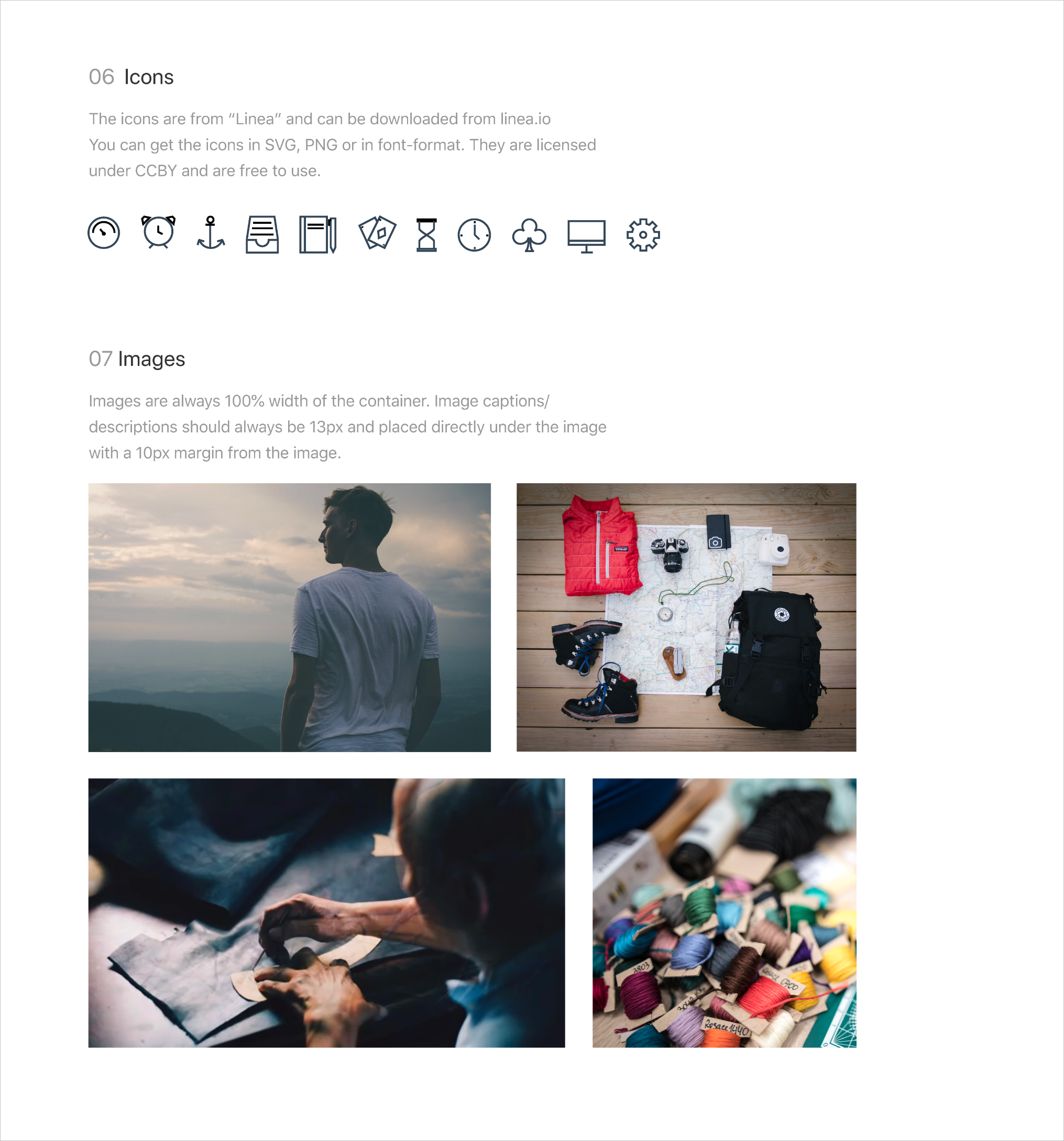
New Design Guide
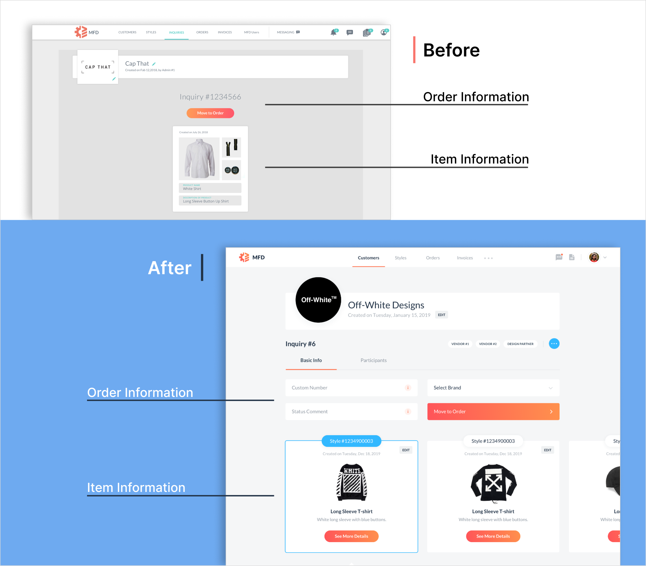
Order Page
Before
Order information: Only the Inquiry Number displayed
Item Information: Item displayed with a name and description. Unclear how one interacts with the module, or if it can be interacted with at all
After
Order information: Able to create a custom Order Number and Edit the status of order. Typical status updates would be simple updates such as “ongoing” or “awaiting approval”
Item Information: Item still displayed with name and description, but how you’re able to interact is more clear. An Edit button will let you make changes, and a Call to Action button to "See More Details” will allow you to do just that
Milestones
Before
Milestone Categories: The categories look like buttons that will take you to another page or launch something. It’s not obvious that they are containers for the milestones within
Expanded Milestone: Expanded view of a Milestone to reveal the files and information inside
Milestone Contents: Contents of the milestones, including files and forms. The forms were initially the way to begin the estimate process and connect users with designers as a first step
After
Milestone Categories: The categories are a little more distinguishable and look more like tabs that would hold information within
Expanded Milestone: New Milestone view that displays the status of the milestone and which user is assigned to it
Milestone Contents: In addition to the files within a Milestone, tasks can now be created and assigned to users within the platform. This gives users the ability to track the status of the order by checking the progress of individual Milestones
New Features
User Comments: To further aid communication, users would be able to leave comments and have relevant conversations per Milestone
Tagged Messages: Users now have the ability to tag relevant messages from chat to individual Milestones
Collapsed Milestone View: While collapsed, the Milestone will display the status and which user the Milestone is assigned to

–––– DESIGN Part 4: Revisiting Chat
Desktop
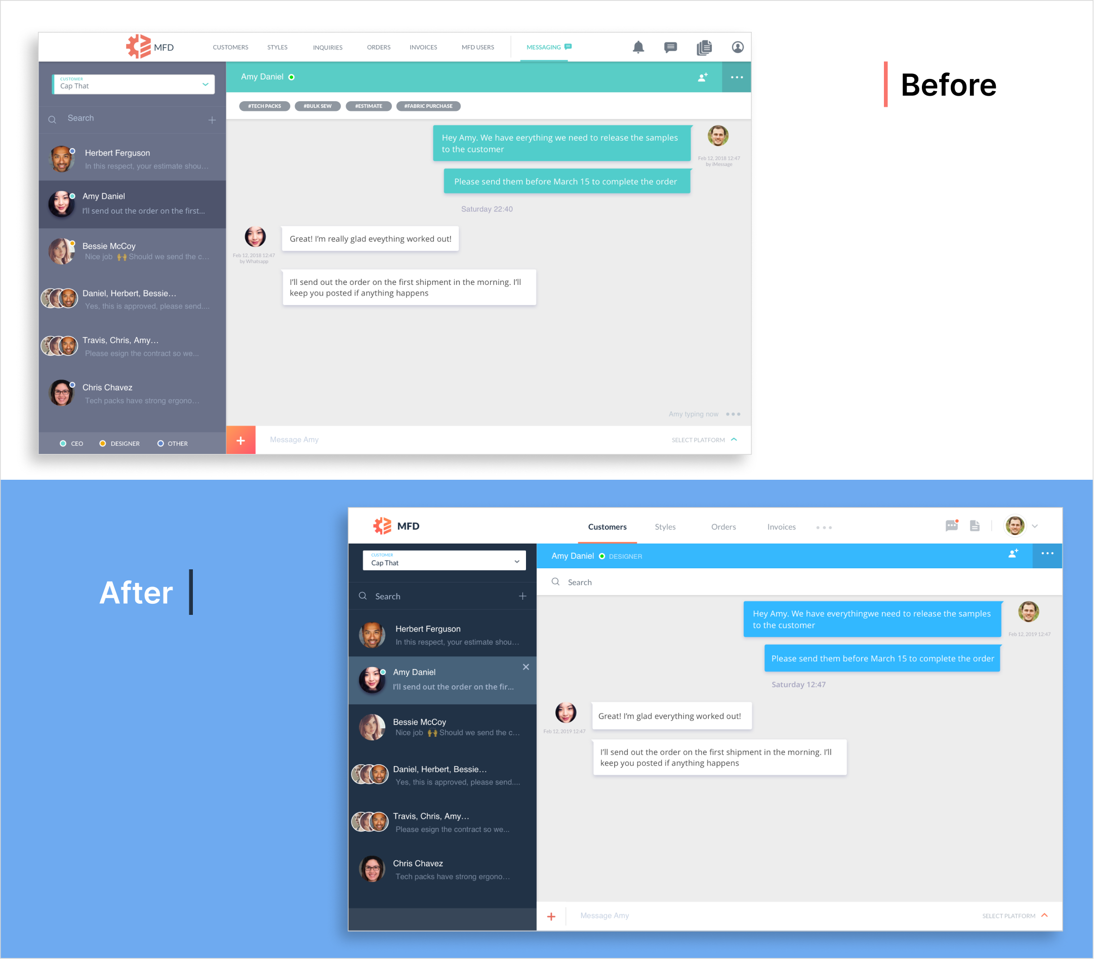
Our first iteration of our working chat didn’t fit the new look and feel of the platform, so we had to update chat as well. There were improvements to be made based on feedback and first-hand experience in using the chat.
Overall look: Same concept with a little less fluff. There were a few features represented that didn’t end up in an actual build, so they were removed from the design. It’s a little cleaner and a little more pleasing to the eye. Could just be the fact that there’s a little less clutter, or it could be something like the colors. Either way, the new design was specifically praised for its new look.
Messaging
Before
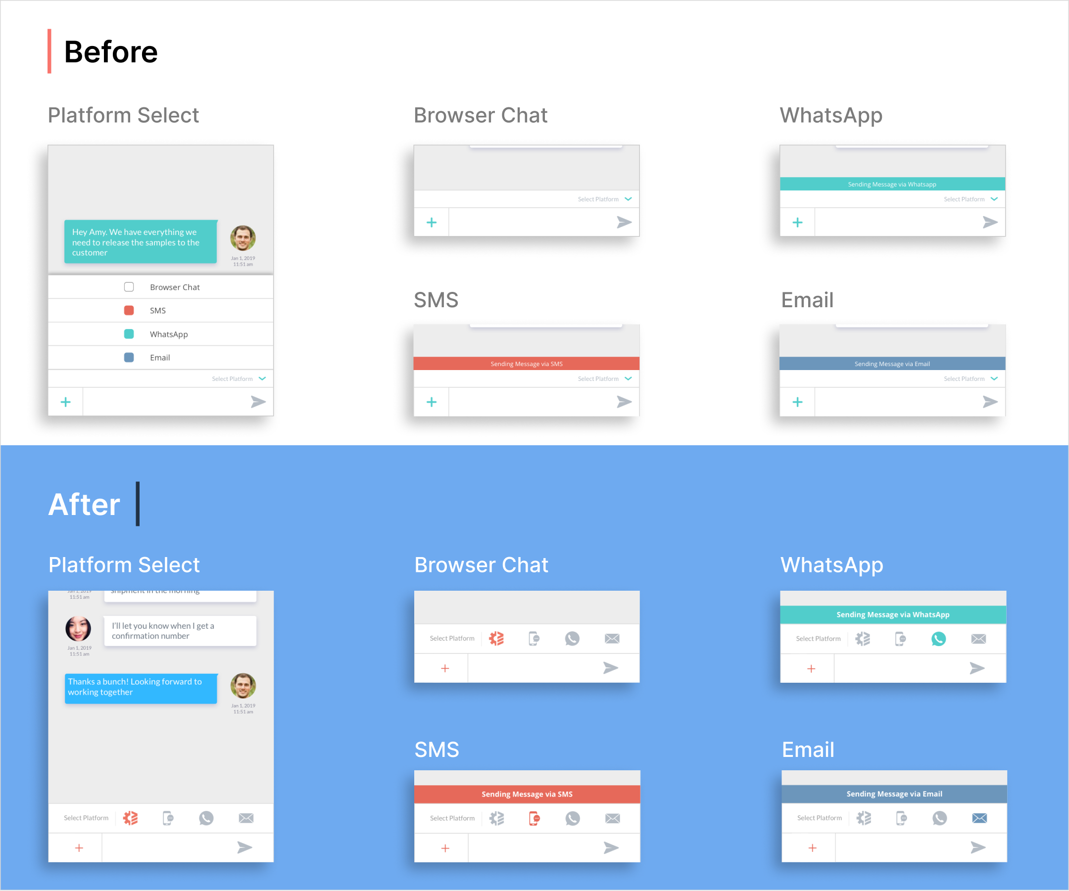
Platform Select: Basic color icons and names to identify platform
Sending Message: Banner color and message corresponds to the platform that was selected
Sent Message: Every message looks the same. No difference between messages sent via different platforms
After
Platform Select: More accurate icons and names to help identify desired platform. A visual aid combined with the label would help avoid confusion.
Sending Message: Larger banner color and text to help visually identify currently selected platform. Added icon near the Select Platform tab to help as well.
Sent Message: The color of the sent message bubble now matches the platform. This will help keep track of how users are sending messages
Desktop Chat Prototype
Mobile
While the overall look and functionality stayed the same, the Platform Select option needed improvements based on user feedback.
Before
The Platform Select function was a dropdown menu. When an option was selected, a banner with a title and a corresponding color appeared to the user to help identify how the next message would be sent.
User feedback told us that the dropdown menu was functional and easy to understand, but physically selecting the platform accurately was tough because of the size of the buttons.
After
Platform Select function changed slightly to give users a little more clarity on the platform that they have selected. The new icons helped users quickly identify which platform they wanted selected, and the larger banner and text would also help avoid any confusion.
There was some debate over the placement of the banner; maybe having it constantly static at the top so that it wouldn’t be in the way the device’s keyboard is active. We would have to test our ideas with users to see which one would be more useful.
End of Project
While I was only with Manufactured for just under two years, I feel as though I had been there for much longer. The transition from sole designer in a more junior role to a more senior position where I was leading a team was definitely a valuable learning experience. I would take the experience and the tools I learned moving forward into future positions.
–––– Other Work
Codename: Main Event
I bet you don’t know who’s fighting this weekend.
The Main Event App keeps fans up to date with fighters and events.
